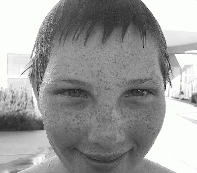
Why monochrome?
I've been fascinated for a long time at how much of a difference there is between monochrome versus traditional color shots.
Monochrome can remove distracting elements, drawing the viewer closer into the subject that's been photographed. The photographer might intent for the viewer to examine it a bit more closely often resulting in a higher emotional response or more memorable photo.
That sounds all hoity-toity, so let me rephrase in simple terms: it can be more dramatic and generally looks really cool.
Here are a few examples I can share-one from a shoot I did for a local community garden, and one I shot for the new series I want to explore.
First, the color version. For me this evokes an overall feeling of a warm nostalgic summer day. You see the 'whole' photo. The background is blurred, but you still take in it as part of the whole.
 |
| Garden Daisies-original photo |
The monochrome version. What background? What stands out here is one particular daisy, and even more specifically, the water droplets on the daisy's petals.
 |
| The droplets really stand out with this one. |
Another example:
Caspian is just chilling out with his paws on the window screen. A cat's life on a lazy day having a good stretch. Then there's the monochrome shot. His look appears to be more intense. What has captured this hunter's attention so completely?
 |
| One thing I notice is that his claws are more prominent, lending a somewhat sinister quality. |
The descriptions I used are probably cheesy, but I wanted to get the basic idea across.
****
The subject matter can also affect the outcome. Andreas Stridsberg lives in Sweden and has traveled throughout Europe. He's always taken his camera along and after what started as a hobby (when I first met him on an online gallery) and a lot of hard work has resulted in becoming well-respected and sought-after photographer. Click on the link to see his portfolio and extensive previews of his work.)
 |
| This shot has an ageless feel to it. |
 |
| A really neat shot on it's own. |
Photos courtesy of Andreas Stridsberg www.mystic-pic.com
 |
This has a sinister, ghostly feel, tinged with some insanity. |
 |
| This one shot from the same series is absolutely beautiful, but skips the darkness of the other. |
Photos courtesy of Andreas Stridsberg www.mystic-pic.com
The monochrome adds an old time ghostly, supernatural feel to it. The difference between the two is incredible. Although the above photos look very different, it's the same model.
.

Photos courtesy of Andreas Stridsberg www.mystic-pic.com
The monochrome effect here seems to evoke a harsh, stark isolation, while at the same time peaceful and finite.
****
When she's not working her 'normal' job, Courtney Campbell is a popular concert photographer.
She is the founder of Musicians Opposed to Bullying and Earplugs Required
 |
| Ronnie Radke |
 |
| Ronnie Radke |
Photos courtesy of Courtney Campbell http://earplugsrequired.com/
The first photo was taken at an outdoor festival. You can see that he connects with the crowd, while the monochrome photo has a remote, almost voyeuristic feel. It's a very powerful, passionate, and intimate image. Ronnie Radke, vocalist for Falling In Reverse.
.
 |
| Jacky Vincent |
 |
| Jacky Vincent |
Photos courtesy of Courtney Campbell http://earplugsrequired.com/
Jacky Vincent, guitarist for Falling in Reverse
Another example of the differences in concert photography. It should be noted that the challenges involved in capturing a good photo are difficult but can be over come with practice and a good eye. Similar to the other concert photos, there is a sense of intimacy in monochrome. When I asked Courtney about the reasons she might use monochrome in an concert setting she said that it could be something as simple as poor red lighting.
****
I'll be going through my bazillion backup disks and pulling out the best to add to the series in addition to the future ones. I started out shooting on a Cannon Powershot D600, then graduated to a Panasonic Lumix, which I still have and use regularly, and my Nikon D3100.
Shot with the Cannon-Oldies but goodies:
 |
| Hyacinth |
 |
| www.anseladams.com |
 |
| www.anseladams.com |
 |
| Ansel Adams, self-portrait. |
I think that's about it for now. A photo post was long overdue. If you have any monochrome photos that you want to share, let me know! A big thanks to my friends Andreas Stridsberg and Courtney Campbell for allowing me the use of their photos. I really appreciate it!
If YOU have any photos you'd like to share, send me an email-I'd be happy to feature what you've done in an upcoming post. The only requirements are that it's appropriate for all ages. (no explicit sex or violence please).
See you soon!
Robyn :)
A last minute add in: Any tips or advice you can share regarding this subject-editing software, specific lenses, etc., is always welcome!


